The Anatomy of Styling a Window Sill
One of the things that drew me to our current apartment are the large, eight foot tall windows in the living room and dining area. They face northwest and bring in a lovely afternoon glow that I really love. When I was finished with designing our living space, I realized though that our sills seemed strikingly bare. Now, my husband is more of a minimalist, and I would consider my aesthetic…more maximalist, (Is that a word? If not, I’m flexing my writerly creative prerogative and making it one.) so I knew I needed to do something with the white space.
Below are the guidelines I used (and even though I said rules, I really mean guidelines since rules can always be broken, and broken well), and they’re generally good guidelines for any kind of display styling.
(Photo: Kimberly Wang)
First rule of window styling: Personalize it with art and photos.
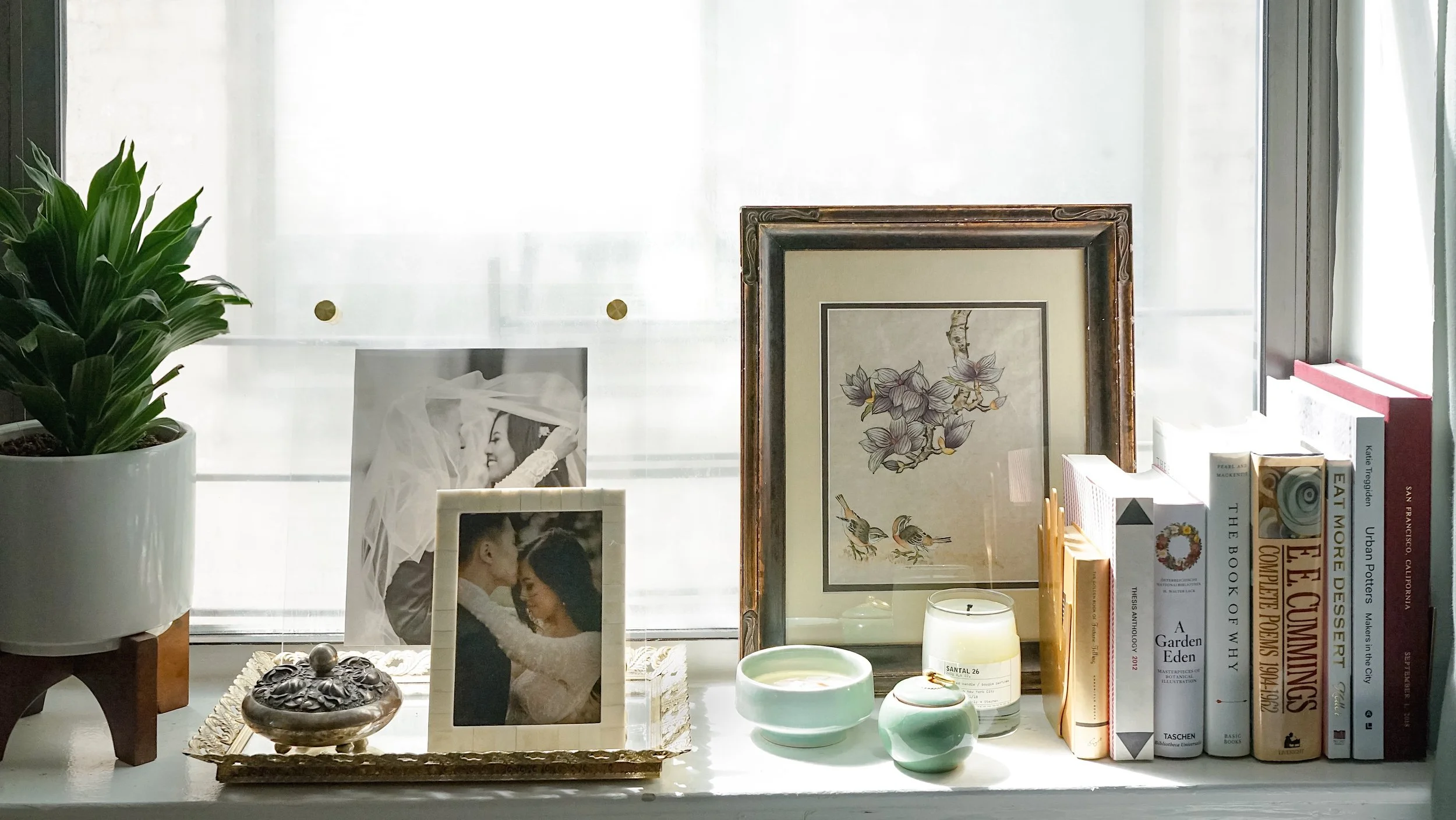
To make the tiny space particularly special, I added some of my favorite photos from our wedding. While the days of drive-thru Fotomat kiosks are behind us, there’s something particularly stirring about having a tangible photograph you can hold and touch. After we received out digital files from our wedding, I printed out a slew of them from Nations Photo Lab, which I can say without being paid to, is my favorite online photo processing lab. The large print in the floating frame was a gift from Artifact Uprising, and I loved it so much, I have three more hanging in our hallway.
The painting is actually one of a pair I did senior year of high school. I knew I was leaving home for good, and wanted to create something I could take with me to decorate my future home with. (Remarkable how prescient my teenaged self was.)
(Photo: Kimberly Wang)
Second rule of window styling: Create designated spaces of interest.
Yes, even for very small real estate, like a sill. I knew I was going to display a variety of things on it, so I sectioned off one side for books, another for my plant. And to define a tiny area for my mini photo gallery, I set down a vintage tray I got from eBay and placed my photos on top.
Sectioning off areas of interest is great for drawing the eye around the space. It also helps with organizing an area in a way that doesn’t feel cluttered.
(Photo: Kimberly Wang)
Third rule of window styling: Add something green.
I feel like adding something green and living really breaths life into decor. Plus, the best light in the room is on our sills, so I picked a plant that would thrive from the indirect sunlight my window received.
I tend to gravitate towards plants that thrive on a little bit of neglect. This one is a very low-maintenance dracaena, which is perfect for my approach towards indoor houseplants. (Maybe someday, I’ll write a piece on creating your own low-key indoor jungle. Let me know if you’re interested in a piece like that below!)
If you don’t have a green thumb or just flat don’t want to take care of a plant, there are some highly realistic faux options out there you might want to consider.
(Photo: Kimberly Wang)
Fourth rule of window styling: Vary the heights of what is displayed.
This is a rule of thumb for more kinds of decor styling. To draw the eye and keep things interesting, you want to play with a variety of heights. Even with the tchotchkes, I like to assemble them with a taller one, a middle height, and a low one. Which brings me to the next rule
Fifth rule of window styling: Keep everything in odd numbers.
I’m not sure exactly why this is true, but it simply is. Perhaps it’s because having things in pairs of two or four seems too…structured? Instead, odd numbers feel a little more effortless. This is also a good rule for floral arranging, but I’ll save that for another time. However, as I said before, this is a rule that has also been broken time and again aplomb.
(Photo: Kimberly Wang)
Sixth rule of window styling: Have a variety of objects that catch the eye.
I tend to be a knick-knack hoarder (I’ll be putting out a Home Accents Under $50 story soon, so look for that). Every time I go on a trip, I like to come home with a special something to display, and so when it came to styling my window sills, I had a plethora to choose from. I have a round loose tea jar from Taiwan, a celadon incense holder from Japan, and a silver jewelry box from Portugal.
Being a book fiend, I also knew I wanted to put books on my living room sill. However, most of the books I read regularly go on our bookshelves (surprise, surprise). So the ones primarily displayed on our window sill are coffee table books.
And finally, you can never have too many candles. This one was a gift from a dear friend that displays my and my husband’s wedding date.
If you have any tips on styling, or if you just want to show off your own window sill, comment below. Let me know if these tips are helpful to you.


